Goal:
Develop a new structure and website content plan, with actionable recommendations, for Kaizen Food Rescue.
My role:
I connected with Kaizen Food Rescue via Catchafire, a site where nonprofits post projects they need help with. I learned from their founder, Thai Nguyen, that she “threw the website together” for launch and she now wanted to tell a more cohesive story about their food access work in the Denver metro area. I was intrigued and decided to commit to the project pro bono.
Deliverables:
Audience and top task analysis
A content planning spreadsheet
A new sitemap
A list of recommendations related to content and site features
Sketch wireframes of a few sample pages, including an “About Us” page focused on the mission, vision, and values
A core strategy statement for future content planning
Results:
After completing the deliverables that were initially planned, I offered more time to implement some of the recommended changes. Thai happily agreed. Below are some of the ‘before’ and ‘after’ screenshots of Kaizen’s website.
““It’s really great and I love you’re able to organized [sic] it for user friendly flow w[ith] the cross links.””
Besides the reward of volunteering for a cause I’m passionate about, it was gratifying to get positive feedback from her.
AFTER
BEFORE
Home page before
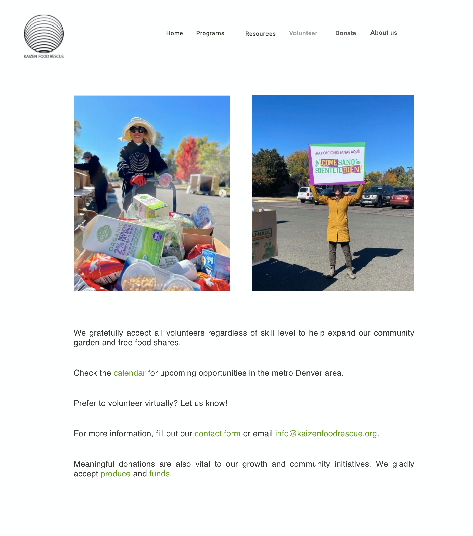
Home page after
Footer before
Footer after
“Donate” page before
“Donate” page after
Process:
The project kicked off with a call with Thai. I had done a preliminary review of the website based on the Catchafire project description, but needed to make sure I understood her goals and expectations. I asked about the evolution of the website and for access to the analytics.
We identified the 3 key audiences for the website:
Food seekers: community members looking for food assistance.
Volunteers: Kaizen needs to continually attract volunteers to support their efforts. I learned that volunteers were often also food seekers who wanted to give back in exchange for the food shares they received.
Donors: Donations and grants keep Kaizen’s programs running and allow them to gradually expand their reach.
I mapped out what each audience’s journey might look like. Volunteers for example, might:
Learn about volunteering opportunities when picking up a food share → go to the website to check the calendar → contact Kaizen to volunteer.
Walk by the community garden → find Kaizen on social media → decide to donate → check the calendar → contact Kaizen to volunteer.
I then did a more detailed review of the existing content to see where it met top tasks and if there were any gaps. For volunteers, for instance, calls to get involved are distributed across the home page, “Calendar” page, and “Programs” page.
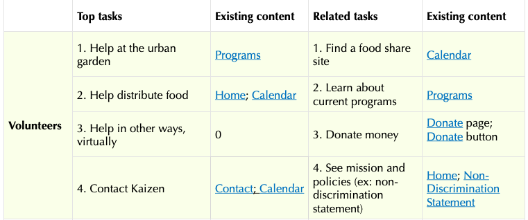
There is no dedicated “Volunteer” page, however. In addition to attracting volunteers in Denver, Kaizen might want to consider listing virtual ways to get involved, especially if help is needed with the newsletter and social media planning.
I also looked at the websites of some of Kaizen’s community partners for comparison. For example:
Boulder Food Rescue gives each program its own page, which keeps pages short and easy to read on mobile, which is where the majority of Kaizen’s traffic is coming from.
United Way Denver includes a clear list of tasks on their home page.
After doing comparative research and auditing the existing content, I created the content plan and detailed recommendations with a few key goals in mind:
Make the home page more useful to the core audience, food seekers
Add more information and CTAs for volunteers
Add more storytelling for donors
Shorten and streamline pages to make them more mobile friendly.
I reasoned there’d be several ways to measure the success of the changes:
The page views on the home page would increase (currently, the Calendar, which has a 78% bounce rate, is in the #1 spot)
More volunteers would sign up to help out.
Donors would be more motivated to donate.
It would be easier for Kaizen to complete grant applications, because the website would have a more coherent story of their impact in the community.
Based on the goals, here are some of the recommendations I shared:
Archive unnecessary pages. The content on these 2 pages does not match any of the main audiences’ tasks, and the bounce rate on them is 82% and 94%, respectively:
Articles
Research
Emphasize real photos of food, volunteers, and community members instead of stock photography.
Make the footer global across the site and use it for actionable items, like signing up for the newsletter, in addition to the current “Donate” and social media buttons.
Make sure all images have alt text descriptions for visitors with low vision or slow internet connections.
Based on the recommendations, I shared a content plan with a full list of pages and the content on each.
Screenshot of the content plan I created
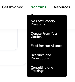
I also recommended a new sitemap that reflects the revised and net-new pages, and a mock-up of the updated global navigation to match.
New sitemap
New navigation
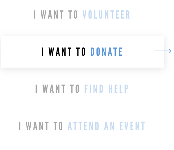
Lastly, I made mock-ups of some of the new pages, including for the new Volunteer page.
Mockup of the new Volunteer page
What I’d do differently:
An important lesson I learned was that non-profits can be short-staffed and overworked (especially when it comes to food assistance in the time of COVID-19), so I had to be patient and wait for responses and feedback. I was glad I persisted in my request for access to the analytics because it was important to me to see them before making changes.
I didn’t realize how many constraints the Squarespace template would impose on some of the designs I would have liked to implement. On a future project, I’d do more research before making mock-ups, so that my mock-ups would be more feasible.
Given the opportunity, I would have loved the chance to do some testing with site users to confirm their top tasks and the usability of the site in general. Given the short-term virtual nature of the project, and the way the organization is pivoting to deal with COVID-19, I didn’t want to make too many demands on their time.