Goal:
An updated recipe form that clearly communicates expectations to users and guides them through the submission process.
Deliverable:
A prototype of the proposed form with explanatory notes and new messaging. Plus feedback “on the words” during the re-design.
Before:
The existing version of the recipe submission form does not state requirements up front; these are signaled to the user with red error text only after submission is attempted. When a user uploads a photo, the form does not show any change (or give the user a success message). Many stylistic inconsistencies are evident.
After:
This low-fidelity version of an improved form includes helpful instructions, guidance through placeholder text, and reminders to submit original content (with reference to “community” and “home cooks like you” as gentle nudges.) I also used a darker font for the field names for better legibility.

Background:
We receive about 11,000 submissions every year, so improving this form could positively impact a large number of users (specifically, users who have to sign in and navigate through several steps to get to the form—they’re motivated!).
I look at recipe submissions on a daily basis. I noticed very early on that the current recipe submission form is not as helpful as it could be.
Namely:
The light font color can be hard to read on a white background.
There’s no indication a cook time, description, and directions are required for the form to submit successfully.
When these fields are skipped, error messages vary widely in tone from “The servings field is required” to “Oops — don’t forget the directions!”
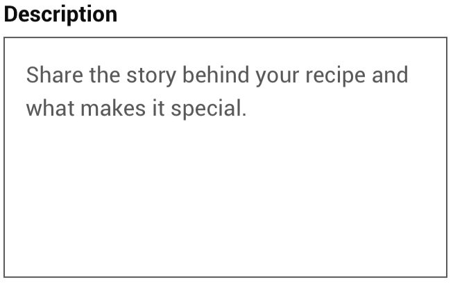
It’s not clear what we expect in the description field. (Plus, the lack of a character count means some descriptions are cut short in the database.)
There are no cues on how to format ingredients (ie. include measurements, preparation, etc.)
There are no tips on what to include in the directions.
There’s no place for footnotes.
There’s no reminder to avoid submitting copyrighted content. As a result, we see lots of copyrighted content in the database that we have to reject after the fact.
I also noticed that Allrecipes International sites took a very different approach to the recipe submission form. I looked at this closely and compared it with the form on the US site.
The International form looks quite different:
Process:
After considering both forms, these are the changes I opted to make.
| Observation: | Suggested Fix: |
|---|---|
| No description of the form's purpose. | Add a basic instruction at the top: “Use this form to share your recipe with the Allrecipes community. Include lots of detail so others can follow your recipe easily!” |
| Light font is hard to read on white background. | Make font color darker |
| Required fields are not signaled to the user. | Add a star symbol to indicate the field is required. |
| No cues to our expectations. | Add placeholder text that’s short and sweet; start with verbs. |
| Long descriptions are sometimes cut short in the database. | Add a character count below the description field. |
| Error messages are inconsistent in tone. | Write all error messages as questions. For example, “What is your recipe called?” when the title field is skipped. |
| Title case is used for fields elsewhere on the site. | Capitalize “time,” “servings,” “in,” and “yield” under photo and “recipe” near radio button. |
| There’s no place for tips/notes. | Add a new field. |
| There’s nothing to discourage submitting copyrighted content. | Add before “Submit” button: “Allrecipes is all about home cooks like you. If you found this recipe in a magazine, cookbook, or on a website, we can’t publish it.” |
Production:
Since I had given the form a fair amount of thought, I was ready when the UX team decided to re-design it. All of my observations and my low-fidelity mockup were included in the design requirements Confluence page.
As the UX team worked on the design, they reached out for feedback on the words!
AFTER
BEFORE

Tell “us” and “other cooks” in the same sentence is clunky. Period missing.
Let’s make it clear what we want here.

What constitutes a ‘step’?

The clearer the instructions, the more likely submitters will provide a complete recipe that others will able to follow.

How do 12 slices serve 8?

In this example, a loaf yields 8 slices. With a clear example, the tooltip is redundant.

The word “personal,” not “private”, is used on the cook’s profile pages. “Choosing yes” is not actually an option.

Group the public options.
“Kitchen approval” is a misnomer since there’s no testing of recipes.
I also added new copy to indicate what “Submit this recipe for publication” means.

Message on draft form in Figma.
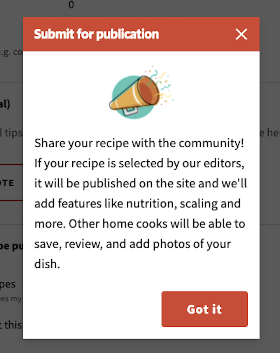
Message on live form.
Almost all of my suggested fixes made it into the final form, though of course, my initial ‘sketch’ evolved quite a bit as the designers worked through mocks and did some user testing. For example, they opted not to mark the required fields, but instead to mark the optional fields. That looked better than a lot of orange asterisks. When a submitter skipped a required field, the error message was formatted as a question (as I suggested in the table above).
Conclusions:
Poor form design is one of my biggest pet peeves on the web. Sharing requirements is much more helpful up front than in an error message after the fact. I wanted to carefully analyze this particular form and make specific changes to improve users’ experience of the submission process. I was proud to collaborate with the UX team on this form and so pleased to see the final version go live! If you’ve got a personal recipe to share, sign into your Allrecipes account and use the new form to submit it!